# Enhanced Outgoing Dashboard
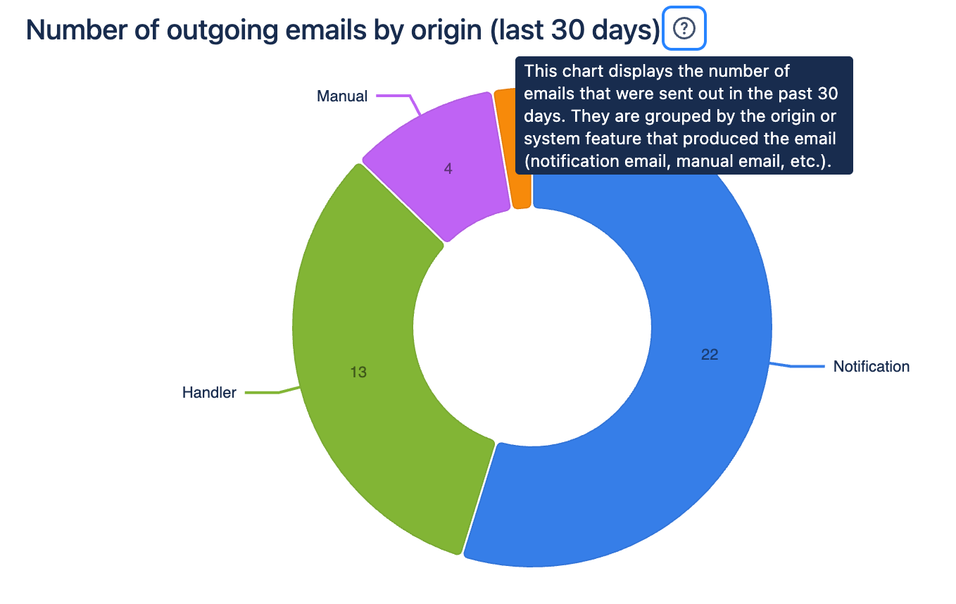
### Outgoing Email by Source
This chart displays the number and distribution of emails by method of sending. It is based on emails sent in the past **30 days**.
Methods of sending emails in Email This Issue
* Notification
* Manual email
* Workflow postfunction
* Mail handler (auto reply emails)
**Benefit**: This chart helps understand which email sending methods are the most active. It also reveals which parts of the app are the most critical for your business processes.
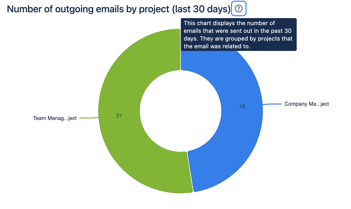
### Outgoing Emails by Projects
This chart displays the number and distribution of emails sent by the Jira projects. It is based on emails sent in the past **30 days**.
Benefit: This chart helps identify the most email-heavy projects.
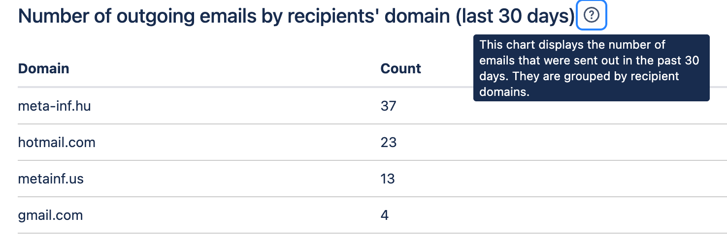
### Outgoing Emails by the Domain of Recipients
This chart shows the number of emails by the domain of the recipients' email address. It is based on emails sent in the past **30 days**.
**Benefit:** This chart helps reveal the most active recipient domains and identify any unwanted email domains to which emails were sent unintentionally.
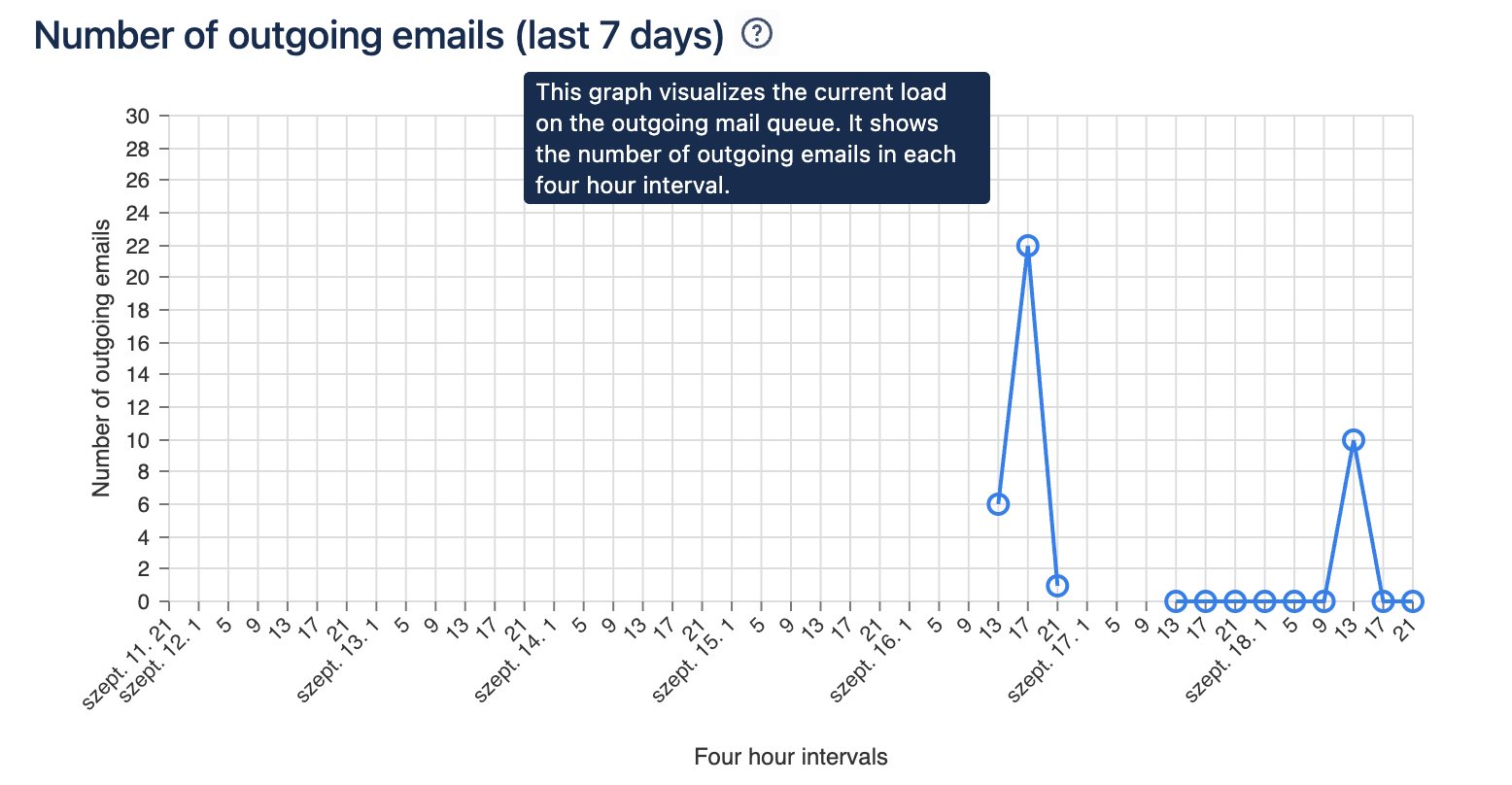
### Volume of Outgoing Emails
This chart reflects the number of emails sent in a four-hour window, based on emails sent in the past **seven days**.
**Benefit**: This chart helps understand the busy times of the day. Peak loads may make delivery slower. High loads may correlate to the Dispatch Time chart.
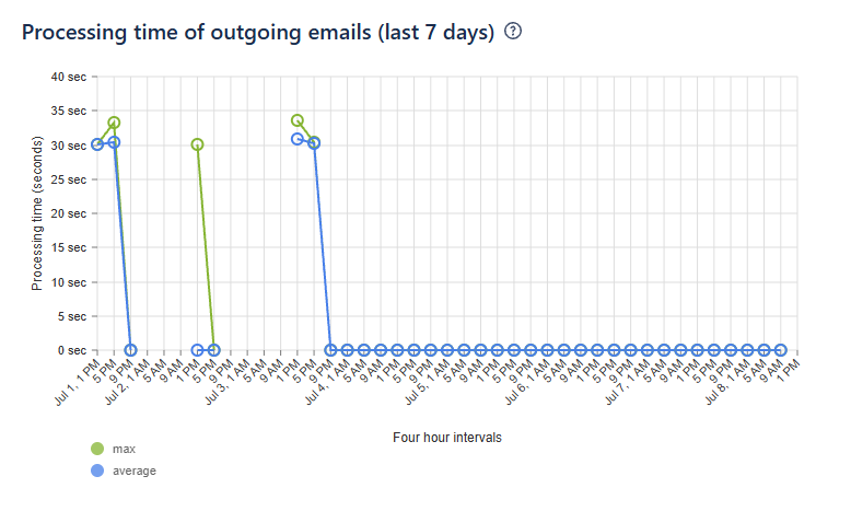
### Dispatch Time of Outgoing Emails
This graph shows the maximum and average processing times for the past seven days in **four-hour intervals**. How much time it took to send out emails successfully.
**Benefit**: This chart (along with the Volume of Outgoing Emails) helps troubleshoot situations when email delivery takes more time than usual.
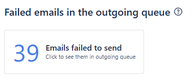
### **Volume of Emails Failed to Deliver (Error Queue)**
The number of emails that encountered an error when the system tried sending them.